
Why Hamnet's Costumes are Oscar Worthy
Hamnet’s costumes bring a rich layer of texture to the film while creating a symbolic color story that bring the film’s world to life. In this video, I highlight how the design does that.
Costume design by Malgosia Turzanska
FULL TRANSCRIPT
[00:00:00] Buzz around the Oscars with the different nominations, and I wanted to take a crack at why some of these films are nominated for best costumes, so today we're gonna look at Hamnet, which is designed by Malgosia Turanska.
I think one of the things that we all can say right off the bat is that Hamnet is filled with a rich, beautiful texture. You get a very strong sense of how the world literally would feel between your fingers. We see this in the costumes with the use of natural fibers, more homespun fabrics, so things that feel a little less refined.
We're seeing a lot of linens and you can tell things are linens and cottons because they tend to wrinkle and rumple and stay wrinkled and rumpled, which is the opposite of what we actually see when we use synthetic fabrics such as, polyester, which you can squeeze those materials and they spring right back. Whereas cottons and linens use, and even some [00:01:00] wools, you squeeze in your hand and they actually hold the wrinkle.
The beautiful thing about linens and cottons is because they wrinkle. They catch the light differently. Because instead of a smooth finish, you get these beautiful shadows that add visual texture to the clothes due to the wrinkling. And I really loved that. Especially with the lighting in the film.
I start with texture personally as a designer. So for me, that was the first thing I picked up from this world, is how texturally rich it is and how much you can really feel that in your fingers. And after the fact, I learned that Malgosia used birch cloth as part of Agnes's red outfit. It really tied her poetically to, this earth and this land and the forest and the sky that Agnes is so tethered to.
So I thought that was a really beautiful choice there to bring that in as poetic. Do I think it read on camera? No, I think it just looked as a beautiful, textured fabric. But I love those moments where it is a [00:02:00] conversation and a known thing between the, the designer and the actor,
A layered nuance of understanding and depth that I think always adds to a performance. Just like you might have an incredibly cool lining in a jacket that feels sumptuous and amazing, and the actor might be the only one who experiences it because they're the one wearing the jacket and can feel it. And the audience might never see it, but that's something that could help them in their performance.
So I really thought that idea behind the Birch cloth as part of, her tunic was a really beautiful use of creativity and in a way of pulling in different material to create a new story with this period. And I do think that period films do not need to be accurate
Because one of the things that I learned and I think that is actually done so beautifully in this film as well as we're talking about it, is that: our understanding of clothing and the understanding of what it is to be a human and be in our bodies today affects the way that we [00:03:00] see period on camera.
And so it's this beautiful way that Malgosia styles these outfits in this film where they feel very accessible to us. The men are wearing their doublets. Open and relaxed versus, how we always see people buttoned up and uptight, and I think it makes these characters much more approachable.
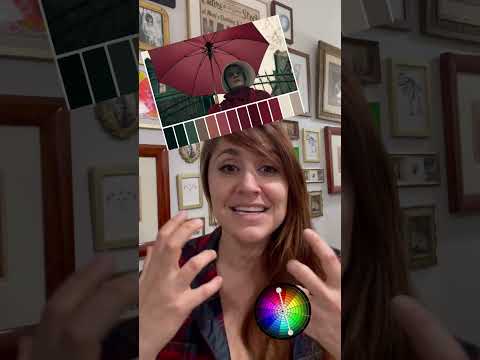
So that brings me to wanna talk about the color story in this film. 'cause I thought the color story was really nice. As we all know, Agnes is in red immediately my perspective of Agnes in this world is that she's this fire. She's a woman of passion and of conviction, and that this is this burning light.
Kind of flame that William is drawn to. At least to me, this film feels much more like her story of loss and processing and finding a new happy ending in a way. Happy ending, right? Nobody's happy after losing a child, but a way to move forward and let go at the end, which [00:04:00] is why I thought it was so beautiful. We come back to this red and that during Agnes's journey, we see her go from this really bright, passionate woman to coming back into herself when Hamnet dies and we see the color drained out of her. She's in these more red browns that feel like the life has been really sucked out of her, and we don't see that until the very end come back when she decides to finally visit Will in the city.
And so I really thought like that's a beautiful color story and that red is really just for Agnes in this movie. We don't see it anywhere else. Which actually, as I'm saying that reminds me that we don't see green on anyone else. That green is solely in this film as a whole, only used for the forest.
And we see it both in the literal physical forest environment, and then on the set as this painted drop of the forest. In the video I have about production design, we can talk about the forest and how that lays out. So check out my next video on Hamnet, which is about [00:05:00] Hamnet's production design. You'll be able to find that video on my channel.
If you're liking this video so far, please hit the and subscribe button below. It helps other people find this channel and it allows me to make more content for you. And if there is a movie that you would like me to break down, please put the information in the comments and I'll do my best to get that done for you.
Going back to color story, if you look at Agnes's family. They're all in warmer tones. We see the browns, we see like an ochre yellow with the aunt. And it's really evident too when Agnes's brother comes to visit we see him in the Browns. And then we have Will's family in contrast, in a gray tones. it was interesting after the fact hearing Malgosia say they use the ink that is exactly the same ink that William Shakespeare used.
And they use that as the dye to dye the different variations of gray that led from, the children being these lighter grays and William being this kind of lighter gray to the father being the darkest, even just right in [00:06:00] there, just between William and his father.
William's, this lighter version of Gray versus his father is black and in black and right there. That in and of itself is a large contrast that kind of shows this rivalry between them. They're of the same world 'cause they're within the same gray tones, but they also have this inherent conflict of this man that is very dark and stoic and heavy versus William, who is a much lighter presence in his family.
So I thought that color story was great and that it really set up nicely for the children. what I thought was really fascinating about. Williams and Agnes's children is that Susanna wears this very rich blue dress when we meet her when she's a little older.
And she was the only child to be born in the forest. So she's got an equally rich blue to her mother's, equally rich red, right? And it's as if these are women of the forest, whereas the twins, Judith and [00:07:00] Hamnet are born in the house that William was born in. And so they seem to straddle the worlds, in my opinion these children who are.
In slightly bluer gray tones that are similar to William's coloring. But yet they have these moments interspersed of ochres and darker blue as these elements within them. So they felt to me much more of this blend between, this woman of the forest and of the earth and Williams family and this kind of marrying that happens between the two.
So I thought that was very interestingHamnet in the play the character and then our young hamnet who sadly passes. And the parallels in which we see with them, at least to me, is that Hamnet on stage is this heightened version of our young hamnet.
He is in a little, more saturated pale blue than our, main hamnet. You can really see how they're [00:08:00] styled the same. So there is this feeling of parallel between the two of them. And I think that parallel between the two of them is what allows Agnes at the end to be able to truly let go of her son as this block in her ability to enjoy life and happiness.
And so I thought that color story was really beautiful. It's subtle and maybe that wasn't intended. Maybe it was. But that's like actually the beauty of watching a movie and interpreting someone's design is we don't always know what they were thinking. The tell of a really good design is that it really does amplify the world. And one of the ways that I felt that it really worked was with the background.
And background is such an important and often overlooked element within films.
when we see the background and all the kind of Londoners in previous moments, they all tend to be very dull. And then we see them at the show in the globe and it's [00:09:00] suddenly this very colorful group of people. It's as if the whole world is coming to life This world that becomes this vehicle of reconnecting to his wife, which is this beautiful moment.
So that was what I thought was so great about the kind of background in this and even seeing the characters on stage be in these grays and blacks in a lot of ways. Similar to, the constraints of Will's family and him showing up in this gray, ghost costume, which, also on a textural note was beautiful because it's this clay costume being something that feels, as if his world is cracking apart. My poetic interpretation of his leather doublets, they become more and more. Slashed, which is the technical term that they would use of these kind of cuts in the period they called them, puff and slash So you would slice and then like on the sleeves, for example, slice and then pull your shirt out through the [00:10:00] hole so you could see it, that these elements of these slashings in the clothes really felt like the ripping apart of his internal
emotions you see him in the rehearsal with his double that is the most shredded, most open, being insistent on how the lines should be delivered and saying, we have to get this right because it matters to him that this story about his son is told. And so that was how I interpreted that costume evolution that Malgosia does.
And then lastly on this film, one of the things that I thought was really beautiful is just there's a lot of little details that are done, that aren't necessary details.
one example, my favorite is just the fact that there was a little el quilted elbow patch put into agnes's red dress, and it's not something that structurally needs to be there.
But it was a little element that created a little more visual texture, something to look at, something, special and unique that showed a level of care and attentiveness to the costumes that I [00:11:00] thought was really beautiful.
So all this said about Hamnet, I think it's a beautiful film. The costumes are great and I'm wishing Malgosia the best with the Oscars coming up. I hope it is fantastic and thank you all for checking out this video.
If you wanna learn more about how design tells story, come check out my workshop text Moving Images. It's where I teach people how to build worlds with design that enhance their stories. I teach you the psychology behind, color line and form, texture, scale and movement, what I call the five tenets of design. These five tenants can help you tell a story without ever saying a word.
That's it for today. Thanks so much for hanging out with me. Until next time, please keep telling your stories and shooting your dreams. I'll talk to you soon. Bye.